I like this website a lot it's very simple there not a lot of scrolling that you have to do it's short and to the point. I think the home screen is designed well because it make you want to see more of his work and it's really easy to navigate through to the other pages
Monday, March 31, 2014
Sunday, March 30, 2014
Www.pinkdophin.com
I like this website I think it shows off the product well but I think that these columns are to wide it kind of throws the design off
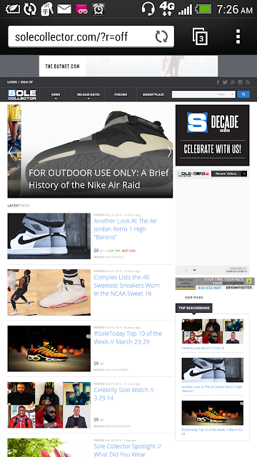
http://.solecollector.com/
I like this website it's mainly informative so the color scheme of the design is pretty basic but the the reviews are layed out works for me to still keep my eyes moving thoughout the design
Thursday, March 27, 2014
Www.beatsbydre.com
I like this website on a computer screen but not so much for a mobile device I think it really shows of the product well on a computer screen but on a mobile device I think its too cluttered
Tuesday, March 25, 2014
http://Muffintopbakery.com
I like the logo in this website design but I don't think the colors work I think the designer should have used the color from the bread. Also as you scroll down there a lot of open space that I think could work better if it was designed differently
Www.mypinkfriday.com
This design is really simple the backrounds and the table are just different shades of pink. the social media links are at the top and they are also pink. it's setup like a big blog of all current information about the artist so I like how smart this website is design all the contact info is on the home page


